Mobile and Web Application UI with Compose Multiplatform


In previous posts, I’ve created the repository and presentation layers of the applications. Now, the time has come for the UI layer. The interaction points are where the user can finally use the application. The most significant benefit of using Compose Multiplatform is that we can use the same UI on all platforms. The once-created UI will be used on Android, iOS, and Web without any problem.
We should use the latest Compose Multiplatform release (at the time of writing, the current version was 1.6.0-rc03).
gradle/libs.versions.toml

compose-plugin = "1.6.0-rc03"
...
jetbrainsCompose = { id = "org.jetbrains.compose", version.ref = "compose-plugin" }
One of the first things that needs to be implemented is a model for our screen. In my approach, this will be a set of essential elements like text, input field, button, image, and more. Each will have its representation in shared code and be resolved to the UI control in the compose module. Suppose we are thinking about the login screen. In that case, we can imagine that it should have an input for an email and input for a password (should be secured), a button enabling us to call the API request, and a button that can change the screen from login to register if we are a new user. Let’s start with the model and some controls.
shared/commonMain/features/login/LoginModel.kt

data class LoginModel(
    val login: InputText,
    val pass: InputText,
    val loginButton: Button,
    val registerButton: Button,
)
shared/commonMain/widget/input/InputTetx.kt
data class InputText(
val text: MutableState<String> = mutableStateOf(""),
val label: String = "",
val maxLines: Int = 1,
val type: Type = Type.NORMAL,
) {
enum class Type {
NORMAL,
SECURE,
}
} Since we are developing a compose multiplatform application, we can easily benefit from the compose mutableStateOf – in the case of InputField, we can use it to hold the current user’s input and use it later in the business logic.
With the provided mutableState, we can use it as the current value of the text and then update it on every value that has changed. Using the remember lambda will ensure that the produced value remains the same during the layout recomposition. The UI representation of the input model may look like this:
composeApp/commonMain/ui/widget/Input.kt

@Composable
fun InputText.Widget(
    modifier: Modifier = Modifier,
) {
    var currentText by remember { text }

    Column {
        OutlinedTextField(
            value = currentText,
            onValueChange = {
                currentText = it
            },
            modifier = Modifier.then(modifier),
            label = {
                Text(label)
            },
            singleLine = maxLines == 1,
            maxLines = maxLines,
            visualTransformation =
                if (type == InputText.Type.SECURE) {
                    PasswordVisualTransformation()
                } else {
                    VisualTransformation.None
                },
        )
    }
}
The button model should be straightforward; we can define an enum class responsible for the styling.
shared/commonMain/widget/button/Button.kt

data class Button(
    val style: Style,
    val text: String,
    val onClick: () -> Unit,
) {
    enum class Style {
        FILLED,
        OUTLINED,
        TEXT,
        FLOATING,
    }
}
composeApp/commonMain/ui/widget/Button.kt
@Composable
fun AppButton.Widget(modifier: Modifier = Modifier) {
when (this.style) {
FILLED -> {
Button(modifier = modifier, onClick = this@Widget.onClick) {
Text(text = this@Widget.text)
}
}
OUTLINED -> {
OutlinedButton(modifier = modifier, onClick = this@Widget.onClick) {
Text(text = this@Widget.text)
}
}
TEXT -> {
TextButton(modifier = modifier, onClick = this@Widget.onClick) {
Text(text = this@Widget.text)
}
}
FLOATING ->
ExtendedFloatingActionButton(
modifier = modifier,
onClick = this@Widget.onClick,
) {
Text(text = this@Widget.text)
}
}
}The last thing to do is to provide this mode via the LoginComponent and handle it in the LoginScreen.
shared/commonMain/features/login/LoginComponent.kt

interface LoginComponent {
    val model: LoginModel
    fun onLoginClick()
    fun onRegisterClick()
}
shared/commonMain/features/login/RealLoginComponent.kt
internal class RealLoginComponent(
componentContext: ComponentContext,
coroutineContext: CoroutineContext,
private val loginRepository: LoginRepository,
private val onLogin: () -> Unit,
private val onRegister: () -> Unit,
) : BaseComponent(componentContext, coroutineContext), LoginComponent {
override val model =
LoginModel(
login = InputText(
type = InputText.Type.NORMAL,
label = "Login",
),
pass = InputText(
type = InputText.Type.SECURE,
label = "Password",
),
loginButton = Button(
style = Button.Style.FILLED,
text = "Login",
onClick = { onLoginClick() },
),
registerButton = Button(
style = Button.Style.OUTLINED,
text = "Register",
onClick = { onRegisterClick() },
),
)
override fun onLoginClick() {
val login = model.login.text.value
val pass = model.pass.text.value
scope.launch {
loginRepository.login(login, pass)
onLogin()
}
}
override fun onRegisterClick() {
onRegister()
}
} Using the previously created scope in the BaseComponent, we can call the suspend function, which will perform the login operation with the httpClient. The onLogin() lambda will be invoked if the API call is finished successfully. The lambda is handled in the RootComponent and will perform the navigation. The login() method will call the API and store the received access token in the TokenRepository. Every next API call will be made securely with the authorization token.
Let’s add some final touches to the LoginScreen, and we will be ready to run it on all three platforms.
composeApp/commonMain/features/login/LoginScreen.kt
@Composable
private fun Content(
component: LoginComponent,
model: LoginModel,
modifier: Modifier,
) {
Column(
modifier = modifier.fillMaxSize(),
horizontalAlignment = Alignment.CenterHorizontally,
verticalArrangement = Arrangement.Center,
) {
Card(modifier = Modifier.fillMaxWidth()) {
Column(modifier = Modifier.padding(8.dp)) {
Text(text = "GAME SHOP!")
Spacer(Modifier.height(16.dp))
model.login.Widget(Modifier.fillMaxWidth())
Spacer(Modifier.height(16.dp))
model.pass.Widget(Modifier.fillMaxWidth())
Spacer(Modifier.height(16.dp))
model.loginButton.Widget(Modifier.fillMaxWidth())
}
}
}
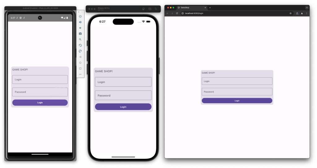
}The Content function should be displayed on the screen. Elements are ordered in the Column and positioned at the center of the screen. The login form is wrapped in the Card component and built with the previously created widgets. When we run all our targets, we should see something like:
After pressing the login button and making a successful API call, the app should launch the games list screen. This requires fetching all the games from the backend before the content can be presented. To do so, we can introduce a state carrying information about the view itself. It should be generic and take any component model. We will use a marker interface for models, a sealed class to represent the current UI state and a component interface that will force such an approach on all components.
shared/commonMain/features/utils/Model.kt

interface Model
shared/commonMain/features/utils/ModelState.kt
sealed class ModelState<T : Model> {
class Loading<T : Model> : ModelState<T>()
data class Success<T : Model>(val model: T) : ModelState<T>()
data class Error<T : Model>(val message: String) : ModelState<T>()
} shared/commonMain/features/Component.kt
interface Component<T : Model> {
val modelValue: Value<ModelState<T>>
} From the UI point of view, we need to implement a collector that can handle state changes and display proper views. We can create a generic extension function for the Component interface. The function will subscribe to the model changes and change views according to the current state. We can define the default behaviours for loading and error state and pass them as lambda expressions. They can be easily changed if some screens handle them differently.
composeApp/commonMain/features/game/GamesScreen.kt

@Composable
fun <T : Model> Component<T>.observeModel(
    loading: @Composable () -> Unit = { DefaultProgressIndicator() },
    error: @Composable (String) -> Unit = { Text("Error: $it") },
    content: @Composable (T) -> Unit,
) {
    when (val modelState = this.modelValue.subscribeAsState().value) {
        is ModelState.Loading -> loading()
        is ModelState.Success -> content(modelState.model)
        is ModelState.Error -> error(modelState.message)
    }
}


@Composable
private fun DefaultProgressIndicator() {
    Column(
        Modifier.fillMaxSize(),
        verticalArrangement = Arrangement.Center,
        horizontalAlignment = Alignment.CenterHorizontally,
    ) {
        CircularProgressIndicator(modifier = Modifier.size(100.dp))
    }
}
Following the same principles as with the LoginComponent, we can now create the GameListComponent, which will display all the games fetched from the API, but with newly introduced tools.
shared/commonMain/features/games/list/GameListModel.kt

data class GamesListModel(
    val games: List<Item>,
) : Model {
    data class Item(
        val id: String,
        val name: String,
        val description: String,
        val image: String,
        val price: String,
    )
}
shared/commonMain/features/games/list/GameListComponent.kt
interface GamesListComponent : Component<GamesListModel> shared/commonMain/features/games/list/RealGameListComponent.kt
internal class RealGamesListComponent(
componentContext: ComponentContext,
coroutineContext: CoroutineContext,
private val gamesRepository: GamesRepository
) : BaseComponent(componentContext, coroutineContext), GamesListComponent {
...
} Using GameListComponent forces us to implement the modelValue field, which should be visible for the UI part of the application but can be modified only by the component itself. We can achieve this by introducing another mutable state. The initial state of the UI should be loading, and then, in the init block, we can use coroutine scope to fetch the games and emit new values for the UI. In the case of a successful call, we will be in the Success state with the proper model, but we should emit an Error in case of a failed call.
shared/commonMain/features/games/list/RealGameListComponent.kt

private val modelState: MutableValue<ModelState<GamesListModel>> =
    MutableValue(ModelState.Loading())

override val modelValue: Value<ModelState<GamesListModel>> = modelState
shared/commonMain/features/games/list/RealGameListComponent.kt
init {
scope.launch {
try {
val games = gamesRepository.getGames()
val model = GamesModelMapper.mapModel(games)
modelState.update { ModelState.Success(model) }
} catch (e: Exception) {
modelState.update { ModelState.Error("Something went wrong") }
}
}
} The model mapper uses a domain Game object and transforms it into a UI model so that the application knows how to display it on the screen.
shared/commonMain/features/games/list/GamesModelMapper.kt

object GamesModelMapper {
    fun mapModel(games: List<Game>): GamesListModel {
        return GamesListModel(
            games =
                games.map { game ->
                    GamesListModel.Item(
                        id = game.id,
                        name = game.name,
                        description = game.description,
                        image = game.imageUrl,
                        price = game.price,
                    )
                }
        )
    }
}
Going back to RealRootComponent, we need to handle the new configuration, navigate, and create the proper component with the component factory.
shared/commonMain/features/RealRootComponent.kt

@Serializable
data object Games : Config
shared/commonMain/features/RootComponent.kt
class GamesChild(val component: GamesListComponent) : Child()shared/commonMain/features/factory/ComponentFactory.kt
fun createGamesListComponent(componentContext: ComponentContext): GamesListComponent shared/commonMain/features/factory/RealComponentFactory.kt
override fun createGamesListComponent(componentContext: ComponentContext): GamesListComponent {
return RealGamesListComponent(
componentContext,
mainContext,
remoteRepository.gamesRepository()
)
} shared/commonMain/features/RealRootComponent.kt
Config.Games ->
RootComponent.Child.GamesChild(
componentFactory.createGamesListComponent(componentContext = componentContext)
) With the created component, we must take care of the UI layer. First, we must make the widget for the game list item. Besides standard elements like Column, Row, Spacer, Card, and Text, the API will provide us with the image URL that should be displayed as the thumbnail.
Although image processing in multiplatform applications might sound complicated, it is pretty easy to develop with COIL, an image-loading library that has composed multiplatform support (since version 3.0.0). Under the hood, COIL uses the KTOR engine to fetch images from the Web.
gradle/libs.versions.toml

coil = "3.0.0-SNAPSHOT"
...
coil-coil = { group = "io.coil-kt.coil3", name = "coil", version.ref = "coil" }
coil-compose = { group = "io.coil-kt.coil3", name = "coil-compose", version.ref = "coil" }
coil-network-ktor = { group = "io.coil-kt.coil3", name = "coil-network-ktor", version.ref = "coil" }
composeApp/build.gradle.kts
implementation(libs.coil.coil)
implementation(libs.coil.compose)
implementation(libs.coil.network.ktor)ComposeApp/commonMain/ui/widget/game/Game.kt
@Composable
fun GamesListModel.Item.Widget(onClick: () -> Unit) {
Card(
modifier = Modifier.fillMaxWidth(),
onClick = onClick,
) {
Row(
modifier = Modifier.padding(8.dp),
verticalAlignment = Alignment.CenterVertically,
) {
AsyncImage(
modifier = Modifier.height(100.dp).width(80.dp),
model =
ImageRequest.Builder(LocalPlatformContext.current)
.data(image)
.build(),
contentDescription = null,
contentScale = ContentScale.Fit
)
Spacer(modifier = Modifier.requiredWidth(8.dp))
Column(
modifier = Modifier.weight(1f),
) {
Text(text = name, fontWeight = FontWeight.Bold)
Text(
text = description,
fontWeight = FontWeight.Light,
maxLines = 4,
overflow = TextOverflow.Ellipsis
)
}
Spacer(modifier = Modifier.requiredWidth(8.dp))
Column(horizontalAlignment = Alignment.CenterHorizontally) {
Text(text = "Price", fontWeight = FontWeight.Bold)
Text(text = price)
}
}
}
} composeApp/commonMain/features/RootScreen.kt
is RootComponen.Child.GamesChild -> GamesScreen(child.component)
composeApp/commonMain/features/game/GamesScreen.kt

@Composable
internal fun GamesScreen(component: GamesListComponent) {
    component.observeModel { model ->
            Content(component, model)
    }
}

@Composable
private fun Content(
    component: GamesListComponent,
    model: GamesListModel,
) {
    Column(modifier = Modifier.fillMaxSize().verticalScroll(rememberScrollState())) {
        model.games.forEach { game ->
            game.Widget()
            Spacer(modifier = Modifier.height(8.dp))
        }
    }
}
The last thing to do is to populate our backend application with some data. We can insert data from Wikipedia into the database at the start of the application.
server/database/DatabaseInitializer.kt
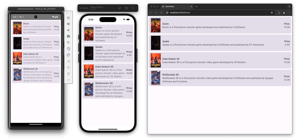
internal fun addDefaultGames() {
GamesEntity.new {
name = "Doom"
description = "Doom is a first-person shooter game developed and published by id Software."
imageUrl = "https://upload.wikimedia.org/wikipedia/en/5/57/Doom_cover_art.jpg"
price = "10.00"
}
GamesEntity.new {
name = "Quake"
description = "Quake is a first-person shooter game developed by id Software and published by GT Interactive."
imageUrl = "https://upload.wikimedia.org/wikipedia/en/4/4c/Quake1cover.jpg"
price = "5.00"
}
GamesEntity.new {
name = "Duke Nukem 3D"
description = "Duke Nukem 3D is a first-person shooter video game developed by 3D Realms."
imageUrl = "https://upload.wikimedia.org/wikipedia/en/6/61/Duke_Nukem_3D_Coverart.png"
price = "15.00"
}
GamesEntity.new {
name = "Wolfenstein 3D"
description = "Wolfenstein 3D is a first-person shooter video game developed by id Software and published by Apogee Software and FormGen."
imageUrl = "https://upload.wikimedia.org/wikipedia/en/0/05/Wolfenstein-3d.jpg"
price = "12.00"
}
} server/database/RealDatabaseFactory.kt
private object SchemaDefinition {
fun createSchema() {
transaction {
...
addDefaultGames()
}
}
} Now, we can run the server and the applications and check what the game list screen looks like.
That’s all. With implemented components, you can build many more screens and functionalities around the Game Shop and benefit from using Kotlin and Compose’s Multiplatform approach to create Android, iOS, and Web applications from one codebase. If you want to extend your application and support desktops, the only thing you need to do is add the Desktop target in the ComposeApp module, and it will work almost immediately.
The GitHub repository implements more features if you want to stay and play around or explore the code.
- HomeComponent with bottom menu that holds game list and user orders
- GameDetailsComponent, which will display the extended description of a game
- AddGameComponent, which allows the addition of new games
- Basic ADMIN role handling that helps to view a list of users in UsersListComponent
- Simple input validation on LoginComponent
- Simple animation of custom loading indicator
- Paddings modifier for WEB wider screens
I hope those blog posts introduced you to the beautiful world of multiplatform applications and showed that this is easier than it looks at first glance. I strongly encourage you to fetch the repo and play around with it, adding some new features, changing UI, and handling API errors gently – there are many things to do. If you have any questions, don’t hesitate to ask!